

Negative Space is also called white space. These are spaces without content although they are called white space, “Negative Space” doesn’t have to be white. It can be any color, it just doesn’t have any content. Negative space is also a design factor although it is not easily recognizable, the use of negative space is to add symmetry to a layout.
Negative space is often seen in logo designs. Here are some logos that use negative space effectively.


The FedEx logo is one of the most recognizeable logo's worldwide. It was designed 1994, by Lindon kindly who was at the time, Senior Design Director at Landor Associates, San Francisco. The logo is a good example of using negative space as there is a hidden arrow between the E and X. Below I have selected information that was gained from the designer after he was asked a series of questions about the logo design.
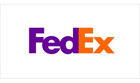 "If you put a lower-case x to the right of a capital E (Ex) you can begin to see a hint of an arrow, though it is clumsy and extremely abstract. I thought that, if I could develop this concept of an arrow it could be promoted as a symbol for speed and precision, both FedEx communicative attributes. And, by the way, different kinds of arrows were utilized with some of the other semi-final candidates, though none of those were hidden.
Once I decided to refine the concept of the embedded arrow, I found that, to make the arrow more legitimate and identifiable, one needed to actually reconstruct the letterforms in order to make the arrow happen. The power of the hidden arrow is simply that it is a hidden bonus. It is a positive-reverse optical kind of thing: either you see it or you dont. Importantly, not getting the punch line by not seeing the arrow, does not reduce the impact of the logo's essential communication. The power of the logo and the FedEx marketing supporting the logo is strong enough to convey clearly FedEx brand positioning. On the other hand, if you do see the arrow, or someone points it out to you, you wont forget it."
No comments:
Post a Comment